Trilanco App Components
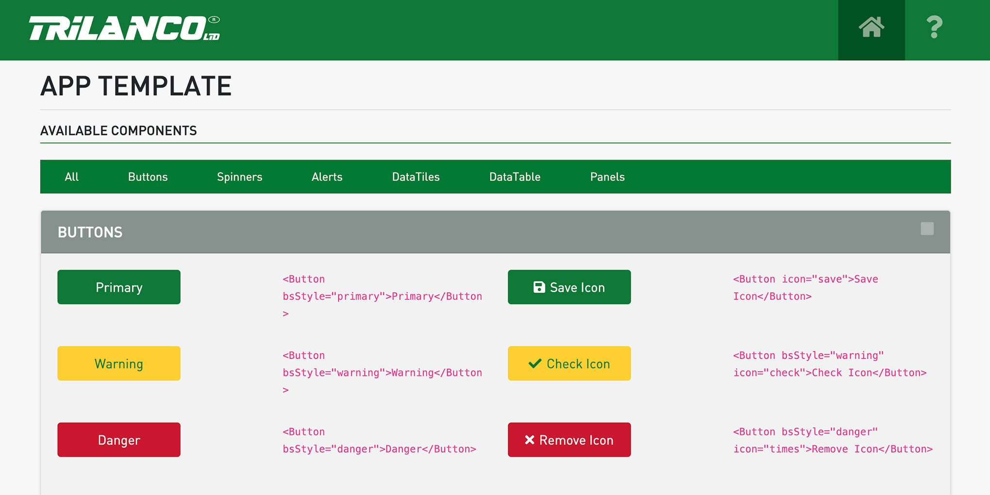
At Trilanco (an equine / agricultural / pet wholesaler), I created a suite of reusable React components for use across internal and external apps. The components are consistent with Trilanco’s branding, and there is an example template which shows you how to use them within projects.
Features
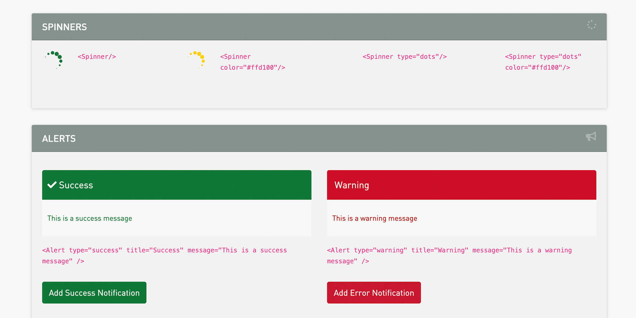
- Themed, branded components such as buttons and spinners
- Filterable data table with 15+ cell types, responsive columns, and permission-aware rendering
- Sortable and filterable lists with bookmarkable URL-based filter state
- Notification system triggered via Redux actions
- Theme support for visual variants across different applications
Technical Details
Component Architecture
The library is installed into projects as a git submodule, ensuring components remain updated across every application that consumes them. It follows a disciplined Container/Presentational split. Presentational components handle rendering via props and are reused freely across features. Container components connect to the Redux store via memoised Reselect selectors and pass derived data down to presentational children. Higher-Order Components handle cross-cutting concerns - most notably a filterable HOC that wraps any list or table to provide sorting, column filtering, and pagination, available in both local-state and URL-query-parameter variants so filtered views can be bookmarked and shared.
Complex components like DataTable are driven by declarative prop configuration rather than imperative logic; column definitions, cell types, sort behaviour, and visibility are all expressed as configuration objects, keeping consuming code concise.
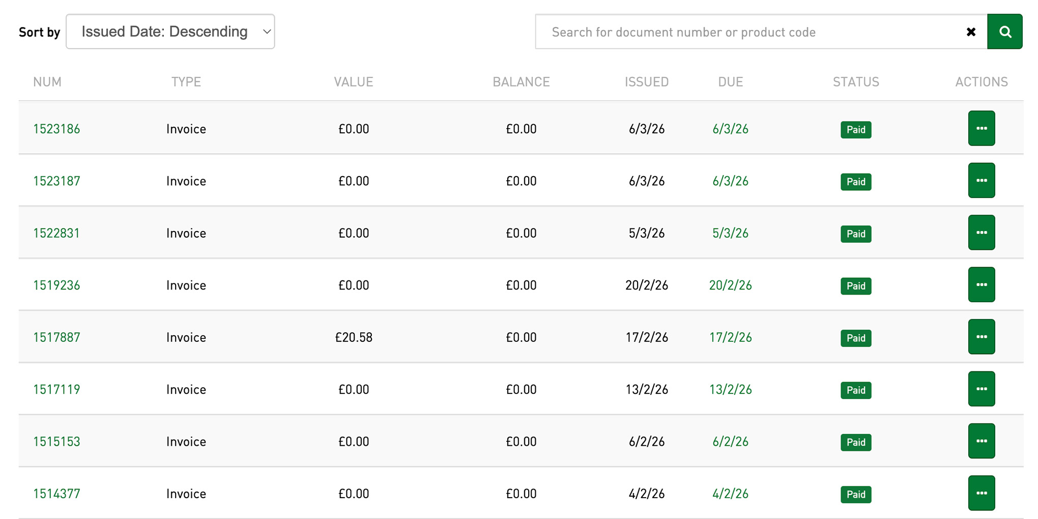
DataTable
The library’s most substantial component, providing a configurable table used across the platform for products, orders, inventory, and other tabular data:
- 15+ cell types — specialised cell components for different data shapes including prices, images, checkboxes, dates, links, and stock levels. New cell types can be added without modifying the table itself.
- Filtering and sorting — integrated via the filterable HOC, with per-column filter inputs and sort toggling on header click.
- Responsive columns — column visibility adapts across breakpoints, with a separate print configuration controlling which columns appear on paper.
- Permission-aware rendering — columns such as price can be conditionally hidden based on user permissions, so the same table definition serves different user roles.
Styling
The library uses SCSS with a token-driven approach built on React Bootstrap. Design tokens for brand colours, breakpoints, spacing, and status colours are defined centrally, giving every component a single source of truth. Components follow BEM-influenced naming conventions to avoid style collisions, and a theme layer allows visual variants without changing component markup.
Testing
Component tests use Enzyme with Jest, mounting components with full lifecycle support and asserting on rendered output, state transitions, and callback behaviour. The filterable HOC has dedicated test coverage verifying filter application, sort toggling, and state management across both local and query-parameter variants.
Screenshots